Wednesday, 20 November 2013

Flyer Example


This is an example of a flyer for a single. The artist whose single is being promoted from this flyer is Olly Murs, who is a British singer-songwriter from the UK.

This flyer was made to promote a single that was going to be released sometime soon. It includes all of the relevant information that a potential buyer would need. For example, the artist, the people featuring on the track and the single's artwork. The colours of the writing match what he is wearing and are big bold so that they stand out as much as possible.

Olly Murs is a singer that is aimed at children and teens, this is because his music can be generalised as "pop", which is also associated with being a child's favourite genre. He is also featured on some children television channel's adverts. This engages the children into the advert, therefore making them look at the product that they are selling or advertising.

The graphology that is used for the singer’s name is how it is presented on all his forms of merchandise. This means that to people who do not know what his name is, or what his logo looks like, they can now see from this flyer for his single.

The image used on this flyer appeals to the audience and genre of "pop" music as it is of Olly Murs himself. This is a general trend for pop music artists to use their faces and image to promote themselves as much as possible. Therefore letting people know what they look like, as this will be what some people will first see of this singer.

This is a good example of a flyer for a single as it gives all the relevant information on one side of the flyer, for example; the single name, who the song features and the single artwork. For the print media based task, I would like to create a flyer for a single or an album and this has helped me to develop my ides further.

Sunday, 17 November 2013

Music Production Poster Example

This poster is an example of a music production poster for a gig. The band whose gig it is advertising is Kodaline, an indie-alternative rock band from Ireland.

This poster was made to promote a gig that they were doing in the area. It includes all of the relevant information that a potential attendee would need. For example, the date, time and place are all placed where they can be seen clearly. The colours contrast each other as parts are black and others are a goldy colour, making the lettering stand out as much as possible.

Kodaline is a band that is aimed at teens and young adults, this is because they are often featured on such radio stations like Radio 1 and TV channels like BBC 3 and the MTV channel, MTV Rocks. These are all aimed at this demographic too. Their main audience is between the ages of 16-30 and would be fans of indie music.
The graphology that is used for the band's name, is their actual logo, this means that their fans will already know who they are and new potential attendees who do not know their music, will be able to recognise them from now on from their logo.
The image used on this poster appeals to the audience as it isn't of the actual band itself, but it is quite abstract. This is a general trend in indie music posters and albums etc.. Because the image is so abstract, it will make the audience think and wonder what is going on in this image.

Because the imagery and artistic direction of this poster are quite unique, it means that the poster is aimed at a more niche audience, and mainly for the people that already know the band so that they know what to expect.
This is a good example of a poster for a gig as it looks interesting, it stands out, has an interesting image and features all of the main things that a gig poster should have. For the print based media task, I would like to create a poster for a gig and this has given me some ideas as to what I can do with it.

Wednesday, 6 November 2013

Gentlemen of the Road Stopovers 2013 (Tour Promotion Example)

This is an example of a promotional tour trailer which can be used for the broadcasting part of the brief task. Mumford & Sons put on a festival once a year in the summer, they invite some of their folk music friends to join them in performing in some of the UK's most serene and "out of place" places.
The trailer gives an insight into what might happen at the festival and the music fits with the genre of the music that they and they're folk music friends’ play. In the trailer it shows some clips from previous shows that they have done on this special summer tour. It shows them on-stage  giving prospecting people an insight as to what they can expect from the festival shows, and it shows some crowd reactions as it shows the excitement that this festival can bring to people, maybe persuading more people to come to the festival.

This video includes some interesting camera angles and shots. It has a slow start that shows a lot of shots of the woods and of trees, this draws the audience in and will make them want to watch further to see what it is all about. In the middle of the video, there is a tracking shot. This doesn't really show what it is filming until it is zooming out, this is a good thing to include and it will make the audience question what the video is all about and will continue watching. And finally, the video ends with a montage of loads of clips of Mumford & Sons on stage. Therefore answering any questions that audience members may have as to what this video is about. So the shots that are used means that it fits the genre of the video as it is a teaser trailer.
This is a good example of a promotional video for a tour because it gives all the relevant information, for example where they are going to be performing. If I were to create a tour promotion video, I would take a lot of the elements from this video as I found it very useful in my research.

House Style of a Music Magazine

This NME cover features the indie rock band called Haim. NME have a very distinctive, varied style. On this cover there are many house styles that would feature usually on every NME cover.

For example, the logo for the magazine "NME" is red, as it is on every cover, and is placed in the top left of the magazine. The red of the logo, allows it to stand out as the background of the magazine is white.

Another example of a house style on this music magazine is where the barcode is placed. It is in the bottom right, where it is on the cover of all of their magazines. It isn't in the way of anything and from this cover we can see how it fits with the image as it is slightly tilted, like the image.

A different example of a house style on this magazine cover is where the band is placed on the cover. Haim are featured on the front, centre of this magazine. For every one of NME's covers, they have a band or singer in the centre of the cover. This is so that they can be seen easily and stands out to fans of the artist or magazine.

The final example of a house style on this magazine is the writing that is featured on the cover. For each cover there is a different font style. This can change due to the singer or band as it depends on what style of music the artist makes. But the font style then stays consistent for the rest of the cover. On this magazine it is quite bold and crazy when it says their name and this carries on with the rest of the magazine. The name of the band on this cover is their logo, so the way that the magazine carries on this trend throughout the whole cover is almost as if it is giving the band an identity so that people will remember them.

I like this example of a house style of a magazine because it defines the band straight away just from the front cover. This is something that I would like to be able to do if I decide to create a front cover of a magazine as this will be the first thing that the audience will see, if they do not know who the band/singer is. Also the manipulation of photography that the band have used on the cover is very clever too. The band are seen taking a photograph with a camera and the front cover is made to look like they are in an old polaroid picture.

Folk Music Moodboard

This is a mood board for my new idea, for promoting a new and upcoming folk singer. Creating another mood board has definitely helped me to look at my new idea and see where I want the idea to go.

I looked at the type of music that the singer will sing and play, the types of people that may listen to this genre of music, how the band would dress when performing and where I think the singer’s music could be played.
This mood board has helped me to see who the music will be aimed at and where this style of music could potentially be performed, i.e. a music festival. It has also shown me that the genre that I want to do now is definitely folk and sub genres that branch off of this. And I think that festivals and smaller events would suit this genre best.

Tuesday, 5 November 2013

Idea Change


After researching indie music and bands for a couple of weeks, I have decided to change my idea. This idea change comes with a new genre of music to promote which is folk and the sub genres that branch off of this. And rather than promoting an indie band, I will be promoting a folk singer-songwriter.

These pictures above show the beginning of my research into folk/indie folk music. The two artists I looked at were Ben Howard and Mumford & Sons. Looking at these two artists has helped me to see how folk music has had an increase in interest in the past 5 years or so. This is why I feel changing my concept would be a good idea.

I have decided to change my idea as I feel that promoting a style of music that may not have been exposed as much as others will bring people to find a new style of music that they may not have heard before, but may enjoy. The audience for this genre of music is very wide and is quite difficult to define. Although I think the majority of people that listen to folk music, tend to be a lot more open to different genres of music.

Sunday, 3 November 2013

Broadcasting Idea


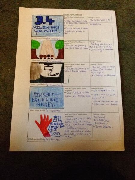
These two pictures show my storyboard for a possible broadcasting video. I based it on the X Factor clip that I posted previously.
This has helped to develop my idea, as if I were to create a video I would like it to be a promotional one, which the X Factor clip shows.

Creating a storyboard has helped me with my research as it opens up my options as to what I can do for a final project. However, at this point I don't think I will be making a video as it may be too complicated for the brief that I have chosen. But I can keep my options open now that I do have a storyboard for my idea.